A Clean, Multipurpose Agency Theme
Showing posts with label editorial. Show all posts
Showing posts with label editorial. Show all posts


SATURDAYS NYC: SATURDAYS MAGAZINE (ISSUE 4)

"Currently one of my favourite publications; Saturdays Magazine have just launched their fourth issue, published by surf and lifestyle brandSaturdays NYC. Consisting of over 300 pages of art, cinema, design, photography and surfing along with interviews with the likes of photographer Duane Michals, director Francis Ford Coppola, Real McCoy's founder Hitoshi Tsujimoto and many more. No advertising in sight just cover to cover editorial." via COLLATE
Love this insight into what goes behind a publication that is recognised, it shows that its not all on screen and getting hands on with the spreads is the best way of making changed. I find it great how the designer is just standing over his spreads and making changes on the floor, definitely something I need to try on a future editorial brief.

Process. A Look into my Sketchbook...

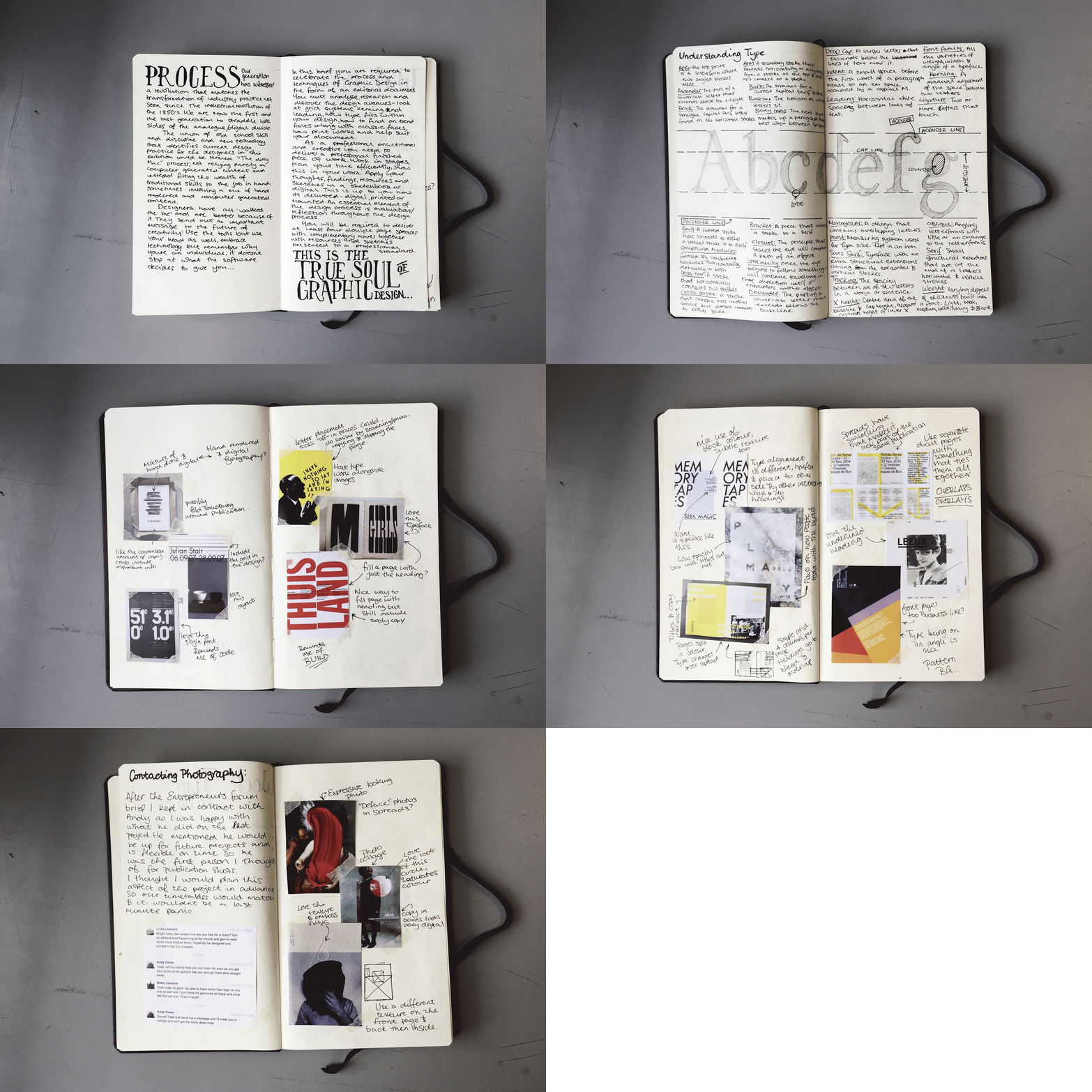
I've always had an interest in how different artists work through projects and have looked at examples of sketchbooks a lot to see how I could improve my work. Looking at examples of fashion sketchbooks in particular made me think of how I could start setting out mine, the ones I looked at were filled with lovely sketches, examples of textiles and other important points in the designs.
For the sketchbook that is shown in this brief I decided to keep it as brief as I could, I noticed in past projects I spent a lot of time working on research and sketchbooks, so with this one I did something about it. I condensed my research a lot compared to other projects, using visual inspiration and designs that influence my final designs and picking them apart. This sketchbook was for an editorial and typography brief where I wanted to step out my comfort zone and do more experimental layouts to contrast my usual clean layouts.
Keep checking back on my blog for the full post on this project and some more insight into my sketchbook!

The Moment Print Became Digital...
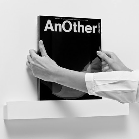
"Some may think print is dying, but print may just become digitized and updated with novel technology, which is what AnOther Magazine is touting. Working with PCH, AnOther’s Spring/Summer 2015 issue is the first of its kind with a customized LED screen in lieu of a traditional printed cover. A high definition Rihanna, shot by Inez and Vinoodh, graces the cover with an accompanying soundtrack by John Gosling for a fully immersive experience. The issue pays homage to Alexander McQueen, and is available to buy now." via HYPEBEAST
Check out the video: http://www.anothermag.com/design-living/7105/another-digital-limited-edition-the-advert
I couldnt believe it when I saw this video for the first time, a definite collectors piece for an editorial fan. Unfortunately the price range is a little out there for me and even if it wasnt all the copies had been sold! This will fit into the subject I have chosen for my essay of the debate of "is print dead?", could this be the project that breathes new life into the medium?

The Typographic Heart...

As mentioned in the previous post the brief for this project was to create an editorial piece on a process. I chose type setting and a certain piece of technology from the 60's, the Linotron 505 (check the last post for the video), this piece was a monologue of the video that was advertising this piece of futuristic tech. Trying to go more experimental with my spreads I kept to a two colour scheme and included a lot of overlaps. When setting out the copy a quote always stuck in my mind, "don't mistake legibility for communication" a famous saying by David Carson, I kept this in mind and overlayed my body copy similar to the images I used, you can however still read it if you know where to look.
Check out the images below:


40 Days of Dating...

"Dear friends, followers, and fans of 40 Days of Dating: Thank you again for reading our story! We are still amazed and humbled that so many of you were interested. After everything, the number one question we received from fans was: What happened after Day 40?
The 40 Days of Dating book is coming out on January 20th, and that question will finally be answered. While the book provides that answer, it covers so much more, through excerpts taken from the journals we kept during the year following the experiment revealing everything that happened between us; Q&A’s about our childhoods, and our lives before we met; a history of dating and a dating map; worst date stories and essays about love and relationships from our friends; tons of new artwork; and much much more. You’re sure to find the before and after story as fun and deep and interesting as the blog. You’ll also find we added an extra layer to the blog, in the margins, that contains our personal remarks on each other’s entries.
It has been an incredible trip as you will see, even the difficult, awkward, and weird parts. In many ways, 40 Days of Dating— the book—is nothing like you might expect: It’s honest, raw, funny, sad, but at the same time full of hope. While some dismissed the blog as a side-effect of the too-much-information generation, many more have been loyal followers of our journey—hating to love it, loving to hate it, or just simply loving it. You be the judge—and we hope you enjoy!" Via http://fortydaysofdating.com/
This publication merges two of my strong interests in a great way, editorial design and hand rendered typography! I love the tone of voice it has, it seems very personal and that links into the interesting concept that is shown in both this book at the movie that goes alongside it. The colours that run throughout seem very playful too, it seems like a very fun book, whether or not it is is another story! Might have to buy it to find that out! Oh and it has Jessica Walsh, who I'm a big fan of.


Ive always been a fan of Jessica Walsh since getting into typography and this book is definitely right up my street! Full of interesting type pieces and a strong concept. Maybe another future purchase!

Fortune Favours the Brave...

The Entrepreneurs’ Forum was created in 2002 by a group of the region’s leading business people, the idea was simple — to create a cross sector peer–group of like minded individuals who could share ideas, knowledge, inspiration and opportunities in a confidential environment. A non trading environment where real business is discussed and introductions are welcomed. Somewhere younger entrepreneurs can tap into the experience of those who have been there and done it — learning from their mistakes and soaking up invaluable business knowledge. A transfer of wisdom that supports growing businesses, nurtures emerging talent and helps to create the wealth, jobs and opportunities that are a major contribution to the sustainable transformation of our regional economy.
The Forum wanted a brochure that would be handed out to guests at their most recent event, Fortune Favours the Brave at Wynyard Hall. The publication should put forward the Forum’s tone of voice in an interesting and engaging way that the audience can relate to.To differ my design from other brochures I chose to do it in an interesting format. To relate to the target audience I chose to do it as a broadsheet newspaper, a publication that a lot of business people/entrepreneurs are familiar with. The newspaper is a 12 sheet publication with two in depth interviews with the entrepreneurs George Clarke and Justin Urquhart Stewart.
The inspiration behind my design came from high end fashion publications and business newspapers like the Financial Times, Independent and the New York Times, these influenced my designs with their simple, effective grid systems. My headlines were inspired heavily by bold letterpress typefaces that would fit well over simple backgrounds and images.
Photography by Andy Oman
Design by Matthew Leonard


The Forecast: A 2015 essential

"The Forecast is Monocle's new annual publication packed with stories that look further, think bigger and look closer at the ideas shaping global affairs, business, urbanism, culture, design and beyond. Monocle films takes a behind-the-scenes glimpse at how the editorial team put this first new edition together."
Monocle is one of my main sources of inspiration when looking at an editorial brief, their spreads always spread out no matter how many images or how much copy is required on the page. This video is a great insight into the techniques of a magazine being made. This could influence how I approach future editorial projects and I will definitely buy the Forecast.

Made Publishers, Made Quarterly...

"MADE Quarterly is a publication that documents the workings of the modern maker, including, but not limited to, industrial design, architecture, fashion, interior design, photography and the culinary world. MADE aims to get inside the heads of those individuals to find out how they do what they do, and what inspires them to create." via MADE PUBLISHERS


I'm a big fan of editorial design after the project we did in the first year, who knew making things look so simple was so hard!? But looking at people that are at the top of their game inspires me to push myself into making better looking work that works for the client and interests people. MADE is a perfect example of a publication I look to for editorial inspiration, alongside Monocle magazine it is a standard I strive towards. Both offering beautifully set out spreads that just seem to work makes me want to improve on what I have done in past projects over and over, there will definitely be an editorial piece coming soon this year, watch this space and see how it comes out.

I LIKE IT. WHAT IS IT? Anthony Burrill...

Looking through Anthony Burrill's website I came across this project, the idea behind it was to create a book full of the posters that he had designed, but what sets this apart to other books of artists' work is that you can actually tear the pages out and use them as posters, this is a great idea, the pieces in the book can actually be used as what they were meant for.
The work inside the book is more of Burrill's self made projects as apposed to his to his commercial work and collaborative projects, ranging from typographic to illustrative posters, to stickers that are removable. Everything is able to do what it is meant to, with the pages being made of a nice weight paper that can stand by itself and give it a poster like feel and not just your average ripped out page. The overall design of the book is very simple, but it works, its straight to the point and beautifully designed.
To look at more of Anthony Burrill's work check out his website: http://www.anthonyburrill.com/
Subscribe to:
Posts (Atom)