A Clean, Multipurpose Agency Theme
Showing posts with label personal. Show all posts
Showing posts with label personal. Show all posts


Trend Prediction: Ready For Your Close Up?

Having recently completed an essay on the ongoing debate of "Is Print Dead?", I stumbled across an interesting find that I had been aware of but didnt give a second thought to until now. Something a lot of designers are doing, a common interest and maybe even a trend. Being in the "Digital Age" where everything can be viewed on a screen some designers seem to be going back to the old techniques, experimenting with foiling and embossing to name a couple. Websites like Collate and Its Nice That seem to be full of beautiful detail shots of projects that include these techniques, giving a real sense of detail in pieces and even including small elements that would sometimes go unnoticed, like the arrow on Build's album cover for Squarepusher, seen above.
I believe as digital continues to grow rapidly and people start wondering what will happen to print as they have since this rivalry began, they will start experimenting and trying to use old techniques in new and exciting ways. Making these pieces of work visible online with the use of professional photography and tight cropped images. Personally I would love to try out some of the old techniques, maybe I will start experimenting with them in the future.

Instagram...

Ive been very active on Instagram for a while now, posting photos of what Im doing, the stuff I wear, the things I eat and recently the work that Im doing. I started posting my hand rendered typography a while back and this got me a few more followers and a couple of likes, some of the pieces even getting reposted on inspiration accounts.
I changed the layout of my account and decided not to use the standard square photo frame you get with Instagram, I think this gives my account a little bit more appeal to look at as it doesnt look like everyone elses. My Instagram is definitely the platform that I post on the most and I think its a good way to get my personality forward, a mixture of work and personal photos being posted almost every week.
Follow me: http://instagram.com/matty_leonard4

Twitter...

During a number of the industry talks the importance of social media was made clear, an easy way to get your work out to a wider audience and network with a number of creative professionals. Twitter kept being mentioned as a way to get my name out there, having used it in the past for a personal account I knew my way around it, but had to completely change the tone of voice of the account.
This would be my professional, creative account where I would retweet interesting work, share what I was working on and mention important factors of my journey this year. I decided that I would keep this updated throughout projects giving people an insight into what I do. Wanting to make my account look more visual I decided I would tweet with images the majority of time, having recently found a love for vector icons I thought this would be a great way to illustrate what I was tweeting about, where necessary. This also works alongside my Instagram account that I am very active on.
Follow me: http://twitter.com/mattyleonard95

How My Design Process Has Changed Over a Year...

I knew that during studying Graphic Design I would grow as a designer and things would change about my design process; however, I didnt think that it would change as much as it has. Even before the course Ive been interested in what I could do in Photoshop and used to do a lot of photo manipulation and digital paintings, most of my work being digital based and being in front of a screen a lot. In the first year of the course I was a self confessed paper-phobe, putting my work in digital documents and spending as little time as I could sketching because I wanted a polished and finished product as soon as I could and I thought this was the best way to do things. Oh how wrong I was.
During the second year of the course theres been a quite dramatic switch, I actually enjoy sketchbooks and the "longer" design process. I say "longer" because the more work I put in a sketchbook and take my time on, the easier it becomes later on. I also found that Asda do Moleskine-esque sketchbooks for a few pound that are easy to carry around, these were my chosen sketchbooks for the year, no more expensive art supply store books that I felt every page was sacred on, scribbles, notes and thoughts jotted down rough, a quick and easy was to get whats in my head down on paper. I definitely think that this has helped both my idea generation and final pieces, making mistakes on paper saved me from spending an age doing it digital to find out it just didnt work. This new process has definitely changed me as a designer, for the better too. Definitely something I will carry on doing in the future.
Check out some of my previous posts on what goes into my sketchbooks! It'll give you a small insight into my process.

First Placement...

Yesterday was the last day of my placement at a local design agency in Newcastle, Cravens. Having done work for a number of different clients including the World Rowing Championships, Virgin Money and 32Red Online Casino I was slightly nervous to see what it was like to be in an actual agency rather than being in the studio at college, that and a mixture of excitement to get some work done and see what they had in store for me.
The two weeks absolutely flew by and was a lot more layed back than I thought it would be, that being said there was a lot of work being done and I was surprised on just how many projects were going on at once, everyone having different jobs to do and jumping from one project to another; a big difference from college where we have up to six weeks to do a single project. The placement also gave me the chance to do some work for an actual client and to my surprise on of my branding concepts for this client got chosen, my first payed piece of work!
Getting this placement definitely inspired me to get some more design work done at college, now I know what speed the industry works at and how you need to be flexible with your time I think I could get quite the amount of work done in the next unit that is going to start soon, which is portfolio building. The guys at Cravens were great to be around and definitely a talented bunch of people, I would definitely say dont hesitate to try and get a placement there if you have a portfolio!

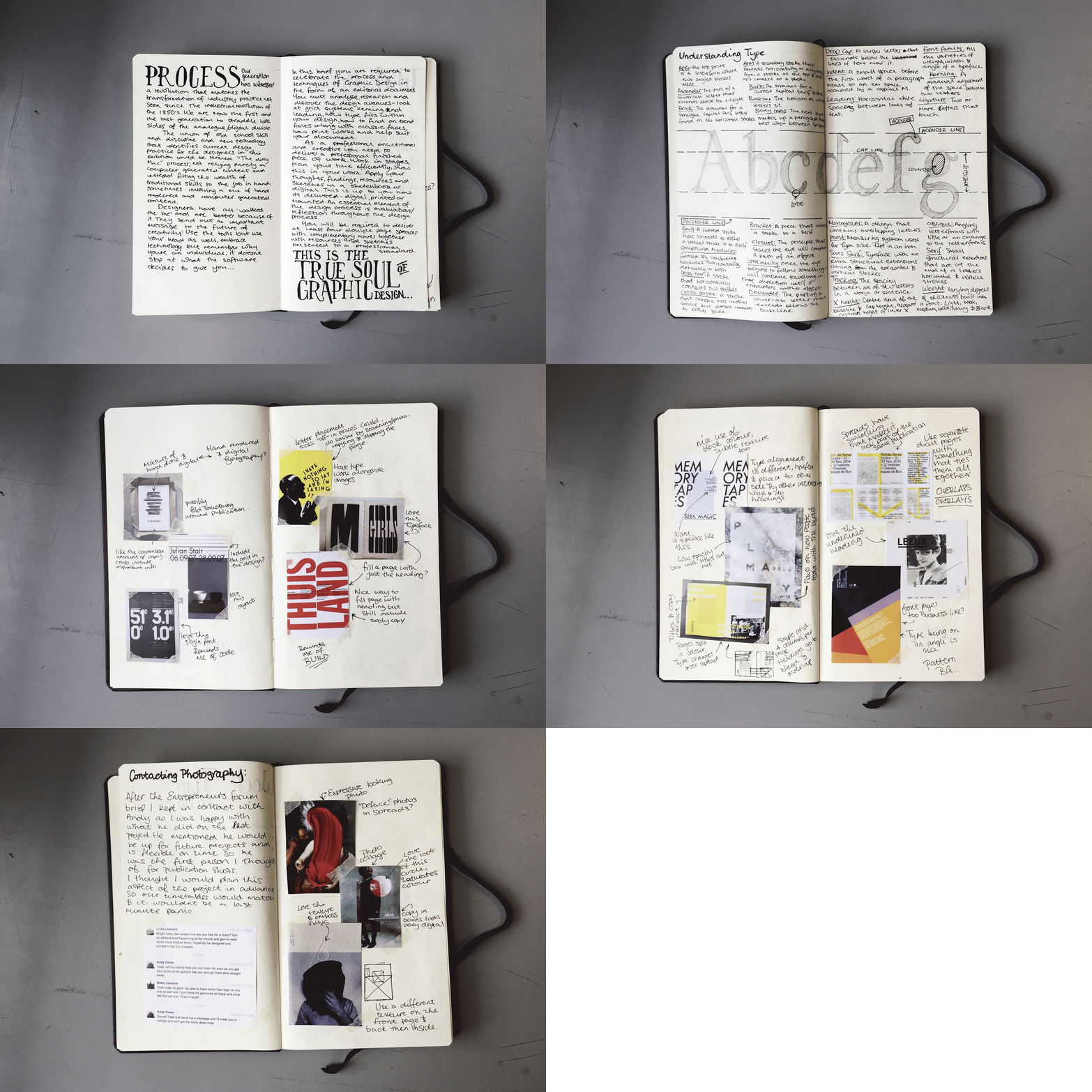
Process. A Look into my Sketchbook...

I've always had an interest in how different artists work through projects and have looked at examples of sketchbooks a lot to see how I could improve my work. Looking at examples of fashion sketchbooks in particular made me think of how I could start setting out mine, the ones I looked at were filled with lovely sketches, examples of textiles and other important points in the designs.
For the sketchbook that is shown in this brief I decided to keep it as brief as I could, I noticed in past projects I spent a lot of time working on research and sketchbooks, so with this one I did something about it. I condensed my research a lot compared to other projects, using visual inspiration and designs that influence my final designs and picking them apart. This sketchbook was for an editorial and typography brief where I wanted to step out my comfort zone and do more experimental layouts to contrast my usual clean layouts.
Keep checking back on my blog for the full post on this project and some more insight into my sketchbook!

Its Grim Up North...

Having posted a work in progress a month or two ago about a project I had going on for the D&AD New Blood Awards. I can now post my entry, based around the statement of "Its Grim up North" its a reply to the Pantone brief of reimagining my hometown in a colour led graphic identity.
Looking at what my classmates were thinking about this brief I noticed everyone was trying to focus on the how great their hometown is and were going polished and technical with their ideas. I decided to step away from this point and try and take the brief in a completely different direction, celebrating the side of my hometown that the tourist board doesn't show everyone, Newcastle has a lot more going for it than the Quayside, so why not show the grubby side in a new and exciting way?
The concept behind my piece is to take abandoned and run down buildings around the city and add splashes of colour to them with the use of the boards on their windows, this in turn would allow the public to change their perception of these buildings and not see them as an eyesore but celebrate them as part of the cities character. My final concept is a city/region wide installation, using paste up posters to cover up boards on windows and run down areas to grab peoples’ attention using colour and imagery on places they would usually walk right past.
Photos by Andy Oman
Designs by Matty Leonard


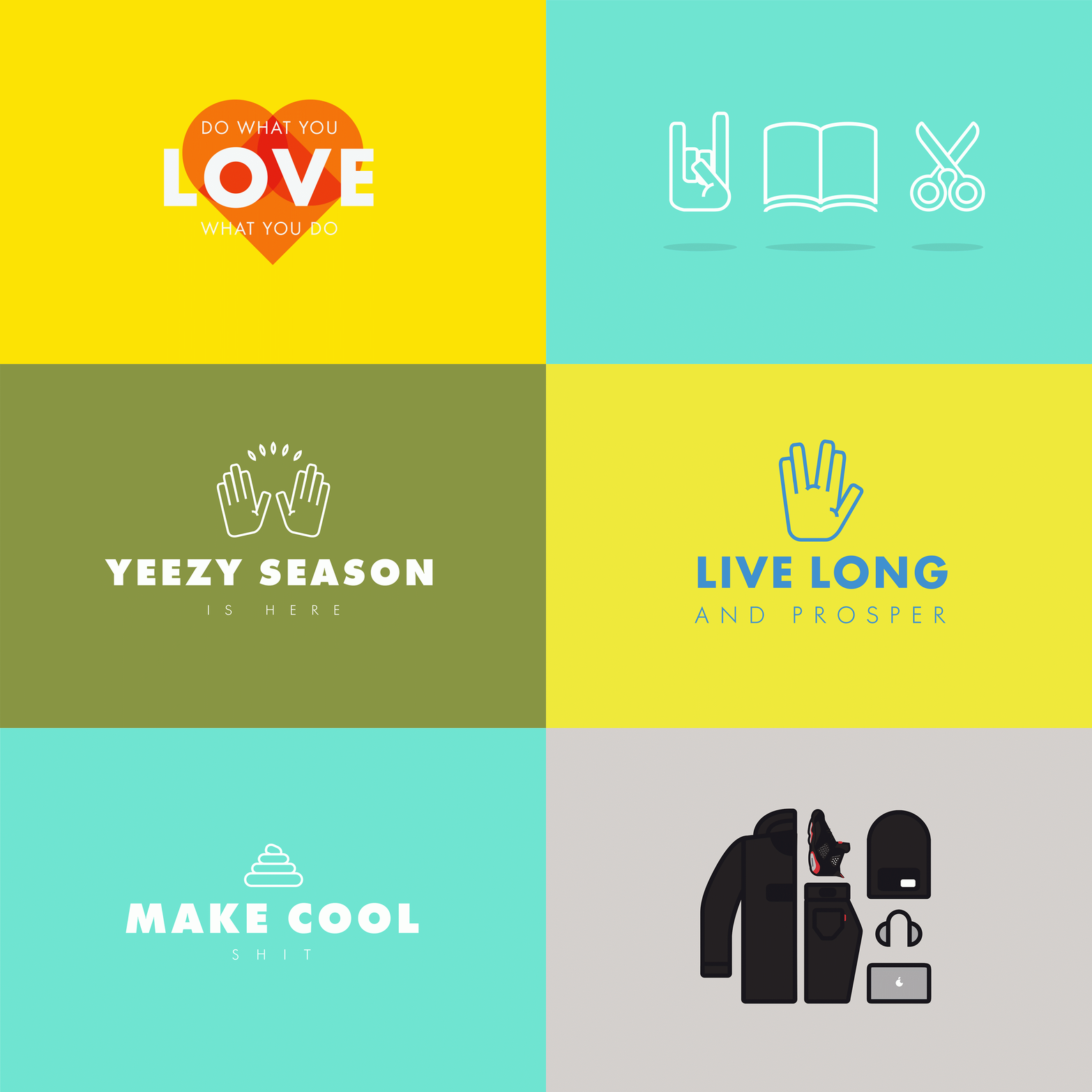
Icons, icons and more icons...

If you follow my Instagram (@matty_leonard4) you'll have noticed that Ive been posting a lot of Vector icon and digital typography pieces, they've really became an big interest with me over the past couple of months. Artists such as Dennis Cortes (@courtesarts on Instagram) put up high quality, simple work on their profiles and one day I just thought to myself "I could do that", so I did. Knowing the basics of Illustrator and knowing my way round the toolbars made this a little bit easier, I'll admit I wasn't as experienced as I thought I was and have had a lot of mediocre looking things made.
So this is my new little mini obsession at the moment and I'm really enjoying it, I think making these simple typographic/illustrative pieces will help me if I have to design a logo in the future too. Its definitely helped get my head round making more difficult shapes in Illustrator as well as creating balanced pieces. Follow my Instagram for updates on my work and check out some of the pieces I've done below:

Possibly the best like I could get...

I know people on Instagram probably don't get bothered about who likes their photo and it's more about the number they get, but this is a big deal for me which sounds really nerdy.
Jessica Walsh is a designer I really look up to, both for her graphic design work and because she got to to the top of the game by not being shy. Sagmeister and Walsh is always an agency that I look at for inspiration and Jessica in particular with her typography speciality is someone I look up to.
To see she has actually saw my work is both inspiring and humbling and I hope I can do a lot more in the future. Definitely a nerdy highlight of the week...

The Typographic Heart...

As mentioned in the previous post the brief for this project was to create an editorial piece on a process. I chose type setting and a certain piece of technology from the 60's, the Linotron 505 (check the last post for the video), this piece was a monologue of the video that was advertising this piece of futuristic tech. Trying to go more experimental with my spreads I kept to a two colour scheme and included a lot of overlaps. When setting out the copy a quote always stuck in my mind, "don't mistake legibility for communication" a famous saying by David Carson, I kept this in mind and overlayed my body copy similar to the images I used, you can however still read it if you know where to look.
Check out the images below:


What do I want to do in 10 years...

I'm getting near the end of my Foundation Degree and the same questions keep cropping up from, "What do you want to do when you leave?" "Where do you see yourself in 10 years?", the answer to the first question is simple and is written on the photo for this post, I want to make cool shit, I want to see my work all over the place, I want to walk down the street and just think to myself "I helped do that". Even if this doesn't happen and I end up designing for small businesses freelance, to know I'm making a difference to someones business and brand and making them look how they imagined will be good enough for me. I just want to design, big and small projects, as long as I get to make something Ill be happy.
The second question is something I haven't really looked into in any great detail, I know I want have experience in agencies and I know that will come with time and getting placements, something which Ive already started doing. If I find myself not liking agency work I could always go freelance, which is what I love about graphic design, if you dont want to be part of an agency you can go and do it yourself, get your own clients, work on what you want. A great example of a designer that did this is Aaron Draplin, I'm a big fan of his work and his mentality, he works freelance because he decided that agency work just wasnt for him and has stayed that way for 12 years. I suppose I'll only know whats for me if I jump into the deep end. Scary stuff! Keep posted to see what happens!

A Grim Work in Progress...

Recently I've really liked the look of Film Photography, following people on Instagram that use this medium really well. I love the imperfect, grainy effect it gives to photos, a big contrast to what you get on photos taken with a DSLR. The way light effects photos also gives this method of photography its own particular style. Being interested in this medium I decided to go old school for a recent project, buying a disposable camera, I hadnt had my hands on one of these since I was little and it was a little nostalgic, top tip from me for this kind of photography, make sure your finger isnt over the lens! Yes, I made that mistake (idiot).
Overall the photos came out exactly how I wanted them, I wanted to capture a grungey feel in them and some of them came out perfect, especially the ones that are under/over exposed. Definitely a fun little way to take photos, I think only having a set number of photos on a film makes you think about what youre shooting more too.
Keep your eyes peeled for my new project, full post coming soon!


A Collection of Inspiration...

I recently decided that I need a place that I can put all of my inspiration onto, whether it be streetwear, sneakers, design or just something that looks cool I thought I would put it somewhere that I could scroll through. In theory making a moodboard of everything I like the look of, so I turned to Tumblr, a simple way of putting photos onto a blog, having used Tumblr previously I can do it easily too and know I can make it look nice. Who knows how long I'll keep this going but right now I'm liking the idea of having something filled with things I like without having to sort them out into Boards like on Pinterest.
Check it out and drop me a follow: http://matthewleonarddesign.tumblr.com/

Fortune Favours the Brave...

The Entrepreneurs’ Forum was created in 2002 by a group of the region’s leading business people, the idea was simple — to create a cross sector peer–group of like minded individuals who could share ideas, knowledge, inspiration and opportunities in a confidential environment. A non trading environment where real business is discussed and introductions are welcomed. Somewhere younger entrepreneurs can tap into the experience of those who have been there and done it — learning from their mistakes and soaking up invaluable business knowledge. A transfer of wisdom that supports growing businesses, nurtures emerging talent and helps to create the wealth, jobs and opportunities that are a major contribution to the sustainable transformation of our regional economy.
The Forum wanted a brochure that would be handed out to guests at their most recent event, Fortune Favours the Brave at Wynyard Hall. The publication should put forward the Forum’s tone of voice in an interesting and engaging way that the audience can relate to.To differ my design from other brochures I chose to do it in an interesting format. To relate to the target audience I chose to do it as a broadsheet newspaper, a publication that a lot of business people/entrepreneurs are familiar with. The newspaper is a 12 sheet publication with two in depth interviews with the entrepreneurs George Clarke and Justin Urquhart Stewart.
The inspiration behind my design came from high end fashion publications and business newspapers like the Financial Times, Independent and the New York Times, these influenced my designs with their simple, effective grid systems. My headlines were inspired heavily by bold letterpress typefaces that would fit well over simple backgrounds and images.
Photography by Andy Oman
Design by Matthew Leonard


Work Based Learning...

The first unit of the year is Work Based Learning, getting us ready for the pace that we'd work at in the industry we were given four briefs, and four weeks to get them to the point of taking them forward digitally. This was a big step up from last year where we had up to six weeks to do one project. This project was a real eye opener of how fast I would have to work in industry and definitely pushed my time keeping.
It was interesting to see how quick I could actually get through a project without messing around and getting distracted. The projects in this unit were also completely different to one another and were about designing things I had never thought of designing, in particular the Donkey Label brief where the aim was to design some cycling apparel.
Below youll find gifs of some of the pages in the sketchbooks for this unit, in the next unit I will develop on one of these outcomes and hopefully get it made. Keep your eyes peeled for the post on the finished piece.


During units this year I have to analyse my work with the use of SWOT analysis', here it is for this unit:
Strengths: I research thoroughly in all projects that I do and check a variation of blogs, industry websites and inspirational websites. Using these websites pushes my work to be both on trend and to a professional standard.
Weaknesses: Even though I haven’t missed a deadline, sometimes my time keeping is my downfall, leaving work to the last minute and maybe rushing it slightly so it isn’t to the best standard it could be.
Opportunities: This unit is definitely an opportunity to improve on my time keeping, having four sketchbooks to complete in the four weeks will definitely force me to plan my time out and stick to a timetable.
Threats: Having a part-time job could definitely be a threat towards my time keeping in this unit, if I have got to get a piece of work done but have a shift at work it may force me to change my time schedule. Having never worked on projects this quickly could also be a problem, if I cant get inspired to do a project I’m not sure how I will motivate myself.

Hand Lettering...

Over the summer I started trying some hand lettering, its something I've always been a fan of and follow quite a few designers that do it on Instagram, artists like Noel Shiveley, Tim Bontan, Seb Lester and Sam Larson being a constant source of inspiration, putting finished pieces and work in progress' on their feed almost daily.
I try to cover as many styles as I can with my typography, housing it in some illustrations, using brush pens and free handing script gives me the chance to get different feels across with my lettering. I keep my pieces simple and try not to over complicate things with flourishes (although looking at Seb Lester's work, it makes me want to try it). In this post you'll find some of my favourites that I have recently done, to keep up to speed with my typography follow me on instagram!


My Targets for the Year...

This blog marks the start of a new year on my Foundation Degree, it will be my final too as I dont intend on doing the top up third year. One of the things we need to have for the start of the year is what we want to get out of this second year, something I havent honestly thought of.
So here it goes, my goals for 2014 and 2015. My primary goal for this year is to improve on the skills Ive learnt in the first year, in the second last project of year one I did my first editorial piece and really enjoyed it; I hope to do more of those this year and actually get something physical made and printed, I think this will be better for my portfolio than just having digital spreads. To help me get into the industry after the course I'm hoping I get the chance to do a placement in an agency, after having a brief think about what will happen after this year is up I would say I'm pretty flexible on where the placement is, but this will probably come when the final year is done.
The main thing I want to take out of this course is an understanding of the industry, improving skills in Adobe programs, speeding up my work flow and working on live briefs for actual clients and maybe even getting my first payed piece of work. This is going to be a very exciting year and I'm hoping it will go well and to get something out of it. We'll see what happens! In the mean time keep looking back at this blog as I'm going to be updating it with personal work and inspirational pieces that are influencing my designs or catching my eye.
Cheers
Matty Leonard
Subscribe to:
Posts (Atom)