A Clean, Multipurpose Agency Theme
Showing posts with label typography. Show all posts
Showing posts with label typography. Show all posts


Jessica Walsh...

A big inspiration to me and a kind of nerdy graphic design crush (if thats a thing) is Jessica Walsh, a designer, illustrator and art director based in the Big Apple as part of the partnership Sagmeister and Walsh. I've looked at her work for around a year now and have become a big fan, especially her hand rendered typography, taking it further than just on paper and applying it onto people and taking her designs to the next level.
Sagmeister & Walsh's work is crazy, the concepts are things I would never think of doing, but its inspiring to see what people at the top of their game can come up with and actually get away with doing, some designers think that the creative freedom that you get with projects in University and my case College stops as soon as a live client is involved, Sagmeister & Walsh prove this isnt the fact and output crazy concepts that meet the brief. I remember watching a video on a live video they made to go onto a screen in Times Square, it was the making of a piece that I had seen before looking through Behance and on thier website and just automatically thought that it was computer generated, I was wrong. This piece spelled out the work MAX, in purple spikes, or thats what I thought. These were actually pencils that had been placed into large cutout letters and then sprayed.
I found the below video when going through a classmates blog to see if I had missed any posts for my PPD unit (inspiration right?!) and found it really interesting, it gives an insight into Walsh and her work as well as a little bit of a back story. In the video she mentions that she got a flat with an ex partner that they could barely afford just to follow a dream and approached Sagmeister for his opinion on her portfolio, he then asked when she could start working. Just goes to show following a dream sometimes works out VERY well.
I will continue to look at Walsh's work and her Instagram is a constant source of inspiration in both hand rendered type and colour, and as I've mentioned in a previous blog post she's actually saw some of my work on there and liked it (crazy). Maybe someday I'll do a Walsh-esque move to another city and land a big job, who knows! Only time will tell...

Sara Marshall Imagines a Corporate World of Hand-Lettered Logos...

"Iconography is one of the most important facets of branding. Countless designers rack their brains filtering through the infinite library of fonts and typefaces available, all in pursuit of making a distinct, meaningful impression on its audience. With this in mind, graphic designer Sara Marshall abandons all of that, instead re-imagining famous brand logos in her latest series: Brand by Hand. Considering the ostensibly timeless logos of Coca-Cola, Burger King, FedEx and more, Marshall created custom scripts based on each brand’s existing color palette, boiling each down to its essence. Ignoring the embedded geometry of each logo – for example, the arrow between ‘D’ and ‘E’ in ‘FedEx’ – Marshall’s experiment does well to test the associations we make with each identity." via HYPEBEAST
Saw this project doing its rounds on Instagram last week, mainly the FedEx logo, was happy to find the designer behind the concept while on Behance, love how theyve took it further and mocked it up onto vans and cans etc. Someone definitely needs to bring hand lettering to a big company!
Check out her work at: http://itssaramarshall.com/

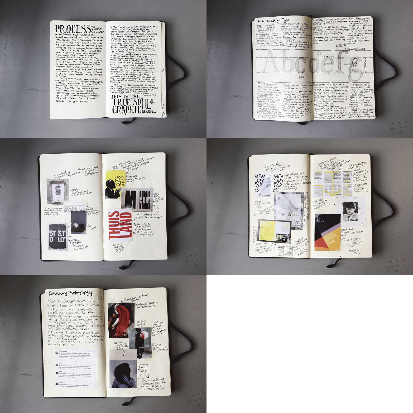
Process. A Look into my Sketchbook...

I've always had an interest in how different artists work through projects and have looked at examples of sketchbooks a lot to see how I could improve my work. Looking at examples of fashion sketchbooks in particular made me think of how I could start setting out mine, the ones I looked at were filled with lovely sketches, examples of textiles and other important points in the designs.
For the sketchbook that is shown in this brief I decided to keep it as brief as I could, I noticed in past projects I spent a lot of time working on research and sketchbooks, so with this one I did something about it. I condensed my research a lot compared to other projects, using visual inspiration and designs that influence my final designs and picking them apart. This sketchbook was for an editorial and typography brief where I wanted to step out my comfort zone and do more experimental layouts to contrast my usual clean layouts.
Keep checking back on my blog for the full post on this project and some more insight into my sketchbook!

Its Grim Up North...

Having posted a work in progress a month or two ago about a project I had going on for the D&AD New Blood Awards. I can now post my entry, based around the statement of "Its Grim up North" its a reply to the Pantone brief of reimagining my hometown in a colour led graphic identity.
Looking at what my classmates were thinking about this brief I noticed everyone was trying to focus on the how great their hometown is and were going polished and technical with their ideas. I decided to step away from this point and try and take the brief in a completely different direction, celebrating the side of my hometown that the tourist board doesn't show everyone, Newcastle has a lot more going for it than the Quayside, so why not show the grubby side in a new and exciting way?
The concept behind my piece is to take abandoned and run down buildings around the city and add splashes of colour to them with the use of the boards on their windows, this in turn would allow the public to change their perception of these buildings and not see them as an eyesore but celebrate them as part of the cities character. My final concept is a city/region wide installation, using paste up posters to cover up boards on windows and run down areas to grab peoples’ attention using colour and imagery on places they would usually walk right past.
Photos by Andy Oman
Designs by Matty Leonard


The Typographic Heart...

As mentioned in the previous post the brief for this project was to create an editorial piece on a process. I chose type setting and a certain piece of technology from the 60's, the Linotron 505 (check the last post for the video), this piece was a monologue of the video that was advertising this piece of futuristic tech. Trying to go more experimental with my spreads I kept to a two colour scheme and included a lot of overlaps. When setting out the copy a quote always stuck in my mind, "don't mistake legibility for communication" a famous saying by David Carson, I kept this in mind and overlayed my body copy similar to the images I used, you can however still read it if you know where to look.
Check out the images below:


Linotron 505...

Some of the imagery in the video is lovely and would look really futuristic back then, in this current project theres a lot of information and images that could be used inside the spreads, I really want to step out of my comfort zone in this unit and create a mental piece with some crazy layouts instead of my usual clean and slick layouts,
Watch the video below and keep posted for news on my new project:

40 Days of Dating...

"Dear friends, followers, and fans of 40 Days of Dating: Thank you again for reading our story! We are still amazed and humbled that so many of you were interested. After everything, the number one question we received from fans was: What happened after Day 40?
The 40 Days of Dating book is coming out on January 20th, and that question will finally be answered. While the book provides that answer, it covers so much more, through excerpts taken from the journals we kept during the year following the experiment revealing everything that happened between us; Q&A’s about our childhoods, and our lives before we met; a history of dating and a dating map; worst date stories and essays about love and relationships from our friends; tons of new artwork; and much much more. You’re sure to find the before and after story as fun and deep and interesting as the blog. You’ll also find we added an extra layer to the blog, in the margins, that contains our personal remarks on each other’s entries.
It has been an incredible trip as you will see, even the difficult, awkward, and weird parts. In many ways, 40 Days of Dating— the book—is nothing like you might expect: It’s honest, raw, funny, sad, but at the same time full of hope. While some dismissed the blog as a side-effect of the too-much-information generation, many more have been loyal followers of our journey—hating to love it, loving to hate it, or just simply loving it. You be the judge—and we hope you enjoy!" Via http://fortydaysofdating.com/
This publication merges two of my strong interests in a great way, editorial design and hand rendered typography! I love the tone of voice it has, it seems very personal and that links into the interesting concept that is shown in both this book at the movie that goes alongside it. The colours that run throughout seem very playful too, it seems like a very fun book, whether or not it is is another story! Might have to buy it to find that out! Oh and it has Jessica Walsh, who I'm a big fan of.


Ive always been a fan of Jessica Walsh since getting into typography and this book is definitely right up my street! Full of interesting type pieces and a strong concept. Maybe another future purchase!

Instagram of the week...

A mixture of amazing typography, cute illustrations and well taken photography this account really stood out for me this week. This "Stay Humble, Hustle Hard" piece was what introduced me to this amazing artist and looking through her feed is definitely a source of inspiration
Give her a follow at http://instagram.com/jennetliaw

I LIKE IT. WHAT IS IT? Anthony Burrill...

Looking through Anthony Burrill's website I came across this project, the idea behind it was to create a book full of the posters that he had designed, but what sets this apart to other books of artists' work is that you can actually tear the pages out and use them as posters, this is a great idea, the pieces in the book can actually be used as what they were meant for.
The work inside the book is more of Burrill's self made projects as apposed to his to his commercial work and collaborative projects, ranging from typographic to illustrative posters, to stickers that are removable. Everything is able to do what it is meant to, with the pages being made of a nice weight paper that can stand by itself and give it a poster like feel and not just your average ripped out page. The overall design of the book is very simple, but it works, its straight to the point and beautifully designed.
To look at more of Anthony Burrill's work check out his website: http://www.anthonyburrill.com/

Hand Lettering...

Over the summer I started trying some hand lettering, its something I've always been a fan of and follow quite a few designers that do it on Instagram, artists like Noel Shiveley, Tim Bontan, Seb Lester and Sam Larson being a constant source of inspiration, putting finished pieces and work in progress' on their feed almost daily.
I try to cover as many styles as I can with my typography, housing it in some illustrations, using brush pens and free handing script gives me the chance to get different feels across with my lettering. I keep my pieces simple and try not to over complicate things with flourishes (although looking at Seb Lester's work, it makes me want to try it). In this post you'll find some of my favourites that I have recently done, to keep up to speed with my typography follow me on instagram!


Mr Bingo

His illustrations are used in a wide range of media, including beer bottles and editorial, he has been featured in the Financial Times and the Guardian newspapers, along with magazines such as Bearded, Dazed and Confused, WIRED and GQ. His signature style runs through everything he does, and even though he says himself that he is not the greatest illustrator in the world, his drawings have a lot of character and are very well thought out. His use of humour gives a very personal feel to his work (even if it is calling someone a cunt), he definitely seems like the type of designer that doesn't take himself too seriously and can have a laugh, shown with the way he handles being called every name under the sun on social media.

Check out Mr Bingos work on his website: http://www.mr-bingo.org.uk/
Subscribe to:
Posts (Atom)